While considering what I would put on a map of the Savage Frontier that I would hand out to players to show the information available to their characters, I was using this original map of the North to mark which sites I wanted to include. I thought about using different sized circles for villages, towns, and major cities, and on a whim made the circles proportional to their population. (Square root of the population equals circle diameter.)
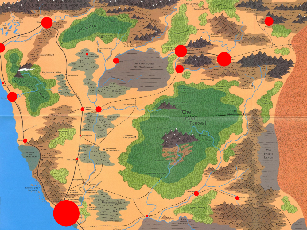 I had not expected it to come out like this. Of course, Waterdeep would be huge, but even with having seen the numbers for all the town many times over the last week, I did not anticipate this distribution of people. I had assumed that the inland road from Waterdeep to Mirabar would be the main area of population with all the black dots on the map, but aside from Yartar and Triboar, they are only tiny specks. In contrast to that, the three Rauvin cities Sundabar, Silverymoon, and Everlund really are one of the main concentrations of people in the region.
Looking at it like this, I think doing this little exercise could be really useful to get a first impression of a region when you read up on it. Actually, this area is the campaign setting I am most familiar with out off all that I know, and I still got surprised 20 years later.
Some other interesting things while I’m talking about this map. Back in 1st edition, the North Was way bigger than it has since 3rd edition. Distances have been shrunk to about 75% their original size, which reduces the total area of the region pretty much by half. Also at some point, the population numbers for Sundabar and Silverymoon got flipped around. Originally, Sundabar had a 30% larger population than Silverymoon. But with Silverymoon being more glamorous, they probably wanted to make it the shining capital of the far north. I think it being the smaller one, and the more industrial Sundabar being the larger one is actually more interesting. And did you know that the people living on the Rauvin river are the last remnant of the Netherese? Somehow that detail never occurred to me all the many times I was reading 3rd edition material on the region.
interesting …. but why? What’s the push/pull among those locations? Why are those southern road cities small while the northeast corner has several population centers? Nasty beasts? Economic resources? Seems like there could be a crap-ton of adventure hooks in that info alone!
That’s where I find this setting archaeology to start being really fun. Using the original text to extrapolate a setting quite different from the one that was later published is quite exciting.